Company Philosophy

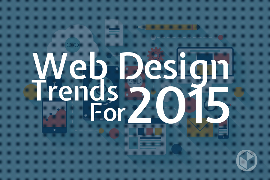
Web design trends for 2015
Date: 19-Mar-2015
Over the past few years,the look of the internet has indeed changed quite a bit for developers and designers. When thinking about web design,you must consider the wide range of possibilities that the internet presents.
Following are some of the most noticeable web design trends evolving in 2015 that will show the creative innovations and new opportunities.
Large background images and video:
A leading trend in 2015 will be the use of high quality images as backgrounds consist of just a few words overlaid on an image.Most of the sites are updating its homepage with a fullscreen video background that has helped this concept into the center. This trend is a wonderful way to make your site stand out.
Parallax effect:
The use of parallax effect for web design is a almost new integration and is gaining fame with many popular websites and organizations.
As the mobile web browsing continues to get better and web design continues to change in the direction of a more effective and enjoyable mobile experience. As scrolling will continue to dominate clicking, designers use page scrolling to animate elements of the page. It’s more intuitive, easier to do, shortened the load times and allows for more dynamic and effective interaction to take place between the user and the website.
Flexible typography
Study has repetitively proved that larger text sizes are helpful to easier reading on the web. Designers have already started to implement responsive typography beside responsive images and structures in their designs. It is crucial for text to always look attractive, despite of platform.
Type kits are becoming more cost-effective or free in the case of Google Fonts and so more scope for working with a lower budget to bring their typography skills to the web design. This also allows WordPress theme designers to include more typographic flexibility in their themes, making trendy type-centric design feasible for anyone with a classy and stylish WordPress theme.
Responsive design evolution:
The year 2015 will finally see the shift where more users browsing on mobiles rather than on desktop computers. So It is necessary that the designers think like a website user or customer at times.This is the reason why responsive designing is so important. It allows a particular website to identify the screen size it is being pulled up on, and automatically adjust to best suit that screen size. This assures that you are getting the finest user experience.
Flat design:
Last few years, flat design did great job and is going to stay for good, especially in smaller elements such as icons, menus and illustrations.
These elements look good as well as they are easily scalable and manageable because of latest icon font technology.
Better Card-based Design :
Web site content desires to fit in different types and sizes of screen. Cards are the simplest way to make that work across platforms.
Cards are a great way to keep things linked, reposition columns without things getting disorganized. It also helps to browse a lot of general information as well as to prompt users to scroll down and view more.In short, cards are clean and easy with a lot of flexibility.
There are many more elements or ideas which will help designers develop an innovative website. The above mentioned trends likely to have high influence the way websites will be created in 2015.
Categories: